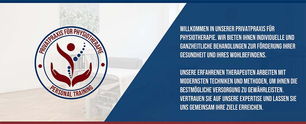
Physiotherapy Center
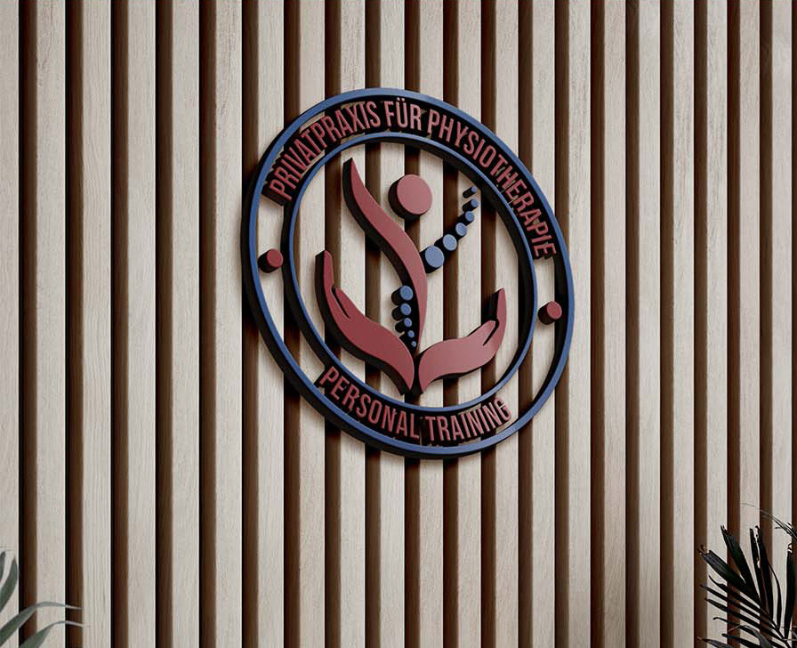
This logo for a physiotherapy center embodies the essence of healing as a continuous journey of support and renewal. The abstract symbol depicts two interconnected figures in a fluid, circular motion, representing the collaborative relationship between therapist and patient. The color palette, combining blue and light green, fosters a sense of trust, balance, and well-being.
Empathy & Motion
Holistic Recovery The strategy focused on "Human-Centric Care." Moving away from cold, clinical imagery, the identity positions the practice as a high-end, personal sanctuary for rehabilitation. The circular composition symbolizes the "Cycle of Recovery," while the interconnected abstract figures evoke the essential bond between therapist and patient, suggesting a partnership in health and vitality.
Color Story
A sophisticated "Medical Contrast" palette. The deep burgundy represents vitality, blood flow, and the passion for healing, while the professional navy blue instills a sense of calm, trust, and structural stability.
Color Palette
#832121 | #1A3055 | #FFFFFF
Visual Elements
The Icon: An abstract, fluid mark representing human forms in motion. The upward-reaching curves symbolize growth, flexibility, and the successful journey toward physical well-being.
Typography: A clean, authoritative Sans-Serif font was selected for "PRAXIS" to establish medical credibility and modern professionalism. This is balanced by a structured circular secondary typeface that frames the identity, ensuring a solid, trustworthy brand mark.
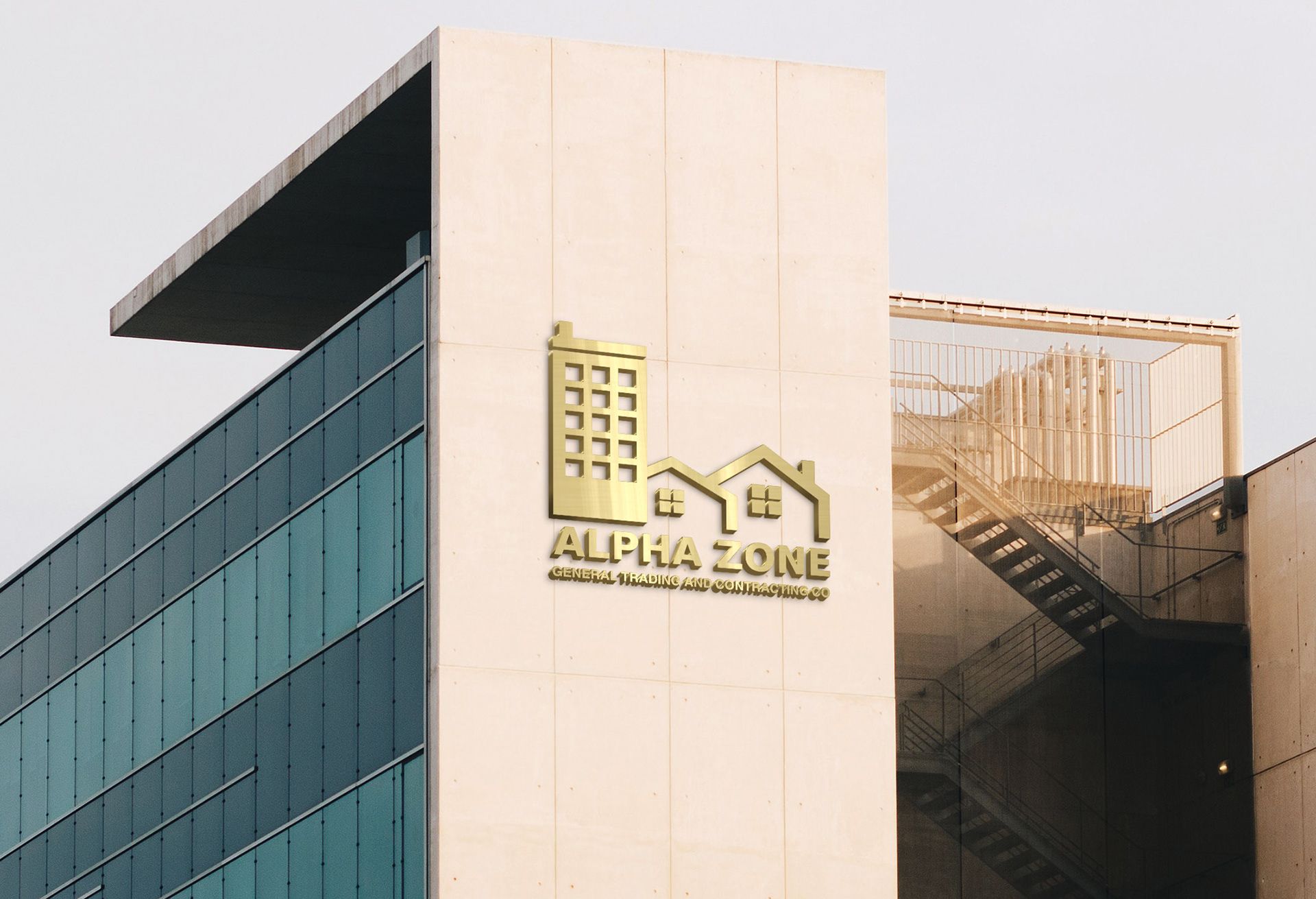
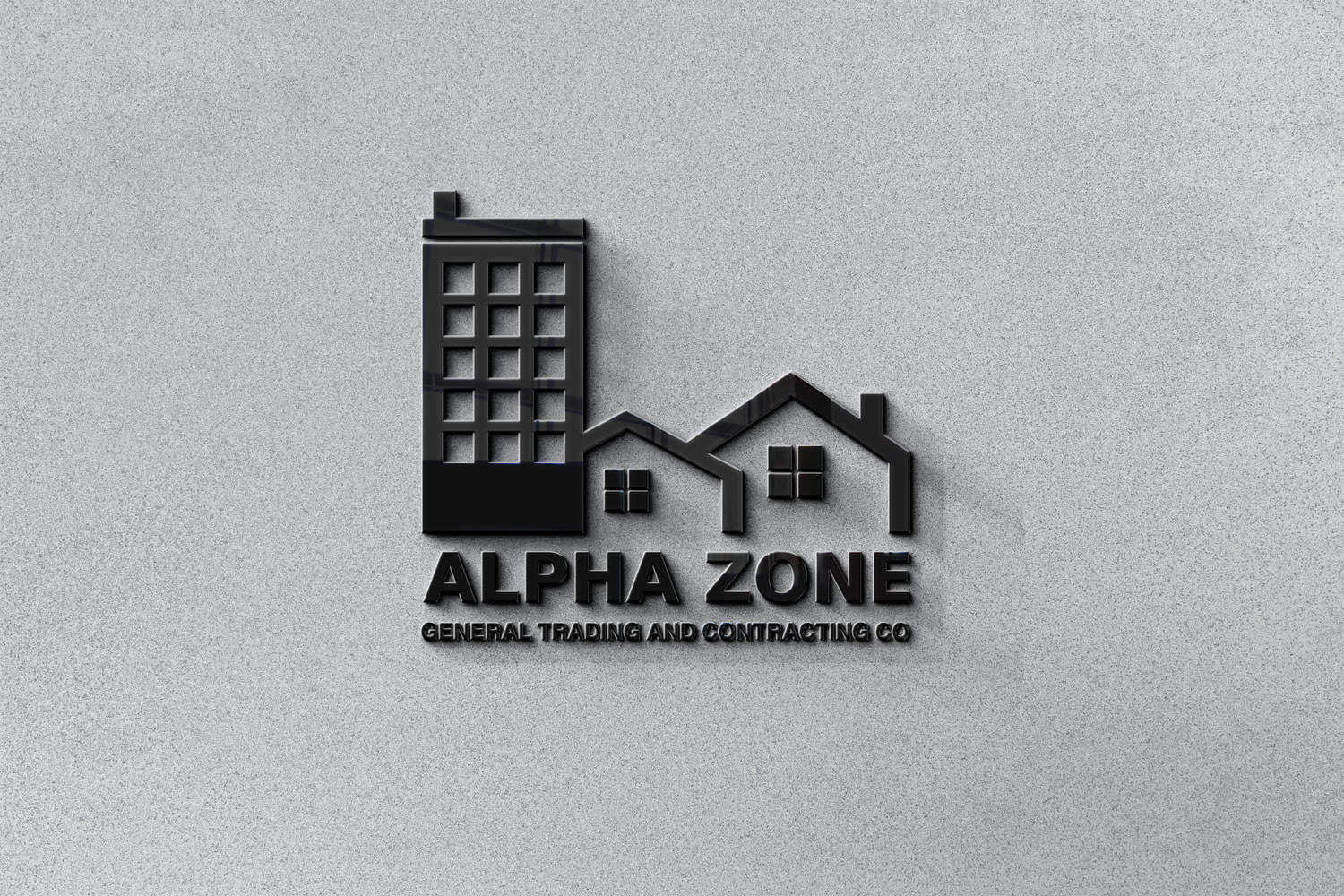
Alpha Zone
A sleek, modern brand identity designed for a real estate leader. The project focuses on "Alpha" as a symbol of leadership and "Zone" as a defined space for premium living.
To reflect this authority, I opted for a Bold Monochromatic approach. Stripping away the distraction of color forces the viewer to focus on the structural integrity of the typography and the symbolic weight of the mark. The choice of a single-color (Rich Black) palette was intentional—it signifies stability, timeless elegance, and a "High-Contrast" brand personality that stands out in both digital luxury listings and physical urban signage.
Defining Luxury Real Estate
Crafting a sophisticated identity for Alpha Zone that bridges the gap between architectural excellence and high-end lifestyle. The visual language conveys stability, trust, and premium market positioning.
Brand Strategy & Logo Design
The Alpha Zone identity is built on the concept of "The Prime Territory." By blending geometric precision with bold typography, the brand establishes a dominant presence in the competitive real estate landscape.
Monochromatic Identity
#0A0A0A | #2D2D2D | #E1E1E1| #F5F5F5
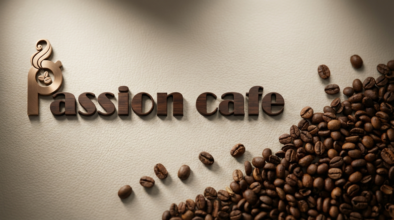
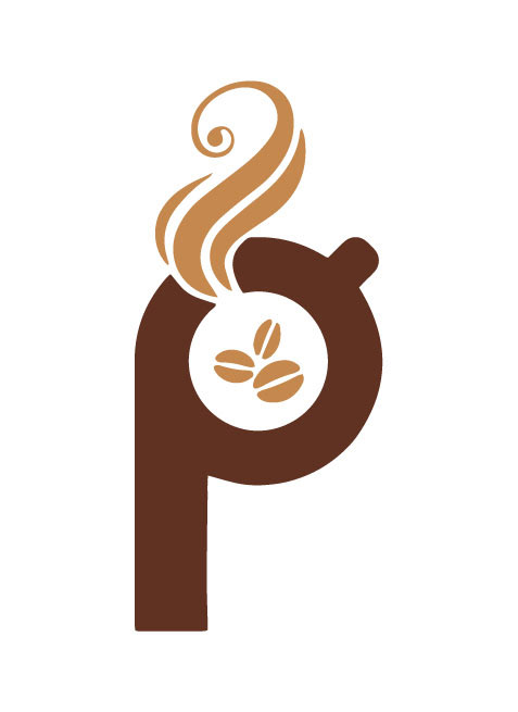
Passion Cafe
Passion Cafe is more than a coffee shop; it’s a destination for true connoisseurs. The goal was to create a visual identity that speaks to the "Passion" behind the craft. The core of the identity is the Monogram Mark, where the letter 'P' is ingeniously integrated with a steaming cup of coffee and roasted beans. This symbol serves as a visual promise of freshness, warmth, and artisanal expertise.
Warmth & Craftsmanship
The strategy focused on "Organic Sophistication." Unlike generic coffee chains, Passion Cafe positions itself as a specialized roastery. The use of soft curves and fluid steam lines in the logo design evokes a sense of comfort and aroma, while the bold, grounded typography suggests stability and a deep-rooted knowledge of the coffee industry.
Visual Elements
A custom-designed 'P' that doubles as a vessel, symbolizing that passion is the primary ingredient in every cup.
Typography: A refined, high-contrast Serif font was selected to balance the modern icon with a classic, timeless feel, echoing the heritage of traditional coffee culture.
Color Story: A rich, monochromatic brown palette that mimics the different stages of coffee—from the dark roast of the espresso to the golden crema.
Color Palette
#c5884f | #613222 | #ffffff
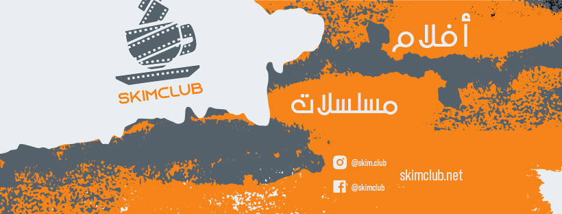
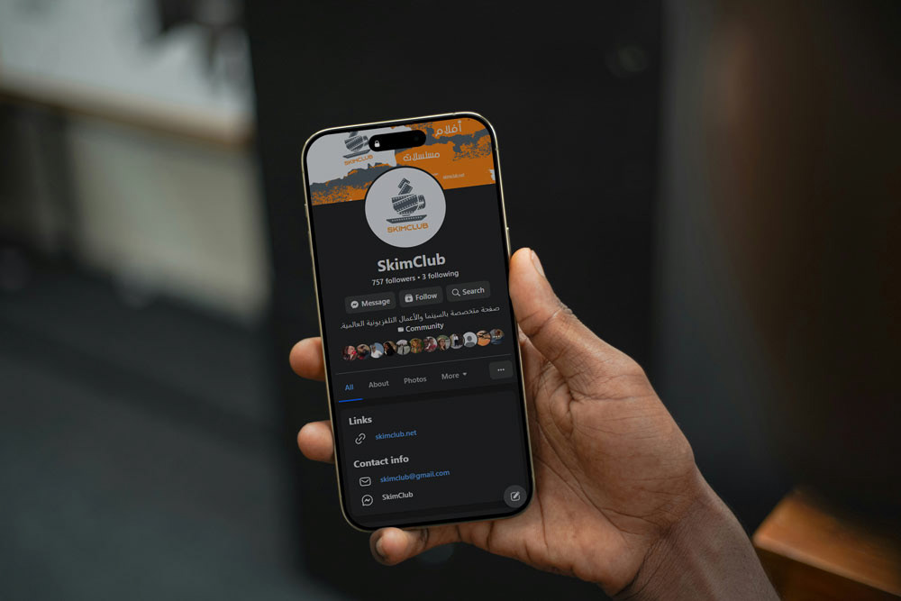
Skim Club
Social Media Branding & Visual Identity: Skimclub
Skimclub is a community-driven hub for film and series critique. For this project, I engineered the complete Static Visual System to ensure instant brand recognition on social feeds. My work encompassed designing the primary Logo, defining a cinematic Color Palette, and establishing Typography standards. I also created a modular set of Social Media Templates and graphic assets. The goal was to translate the "Big Screen" atmosphere into a cohesive, mobile-first visual language that captures attention in a crowded digital space.
Core Identity Design
The primary vector logomark presented in its purest form. This highlights the geometric structure, negative space balance, and scalability of the design without environmental distractions.
Color Palette
#55626b | #fa8619 | #e9eef1

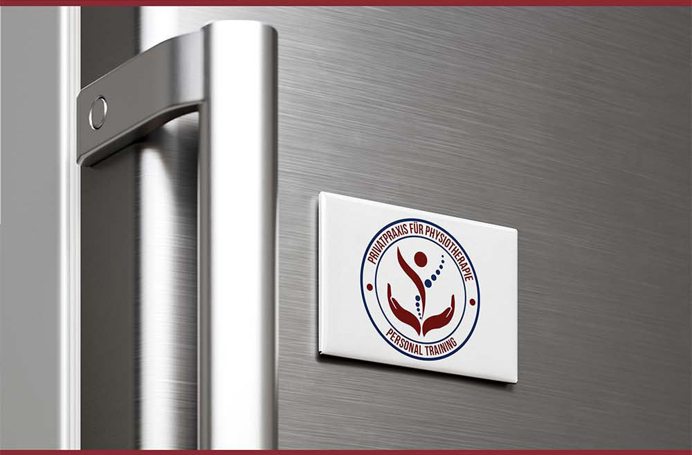
Brand Context & Application
A real-world visualization of the brand mark, demonstrating how the visual identity adapts to physical and digital surfaces while maintaining legibility and impact.
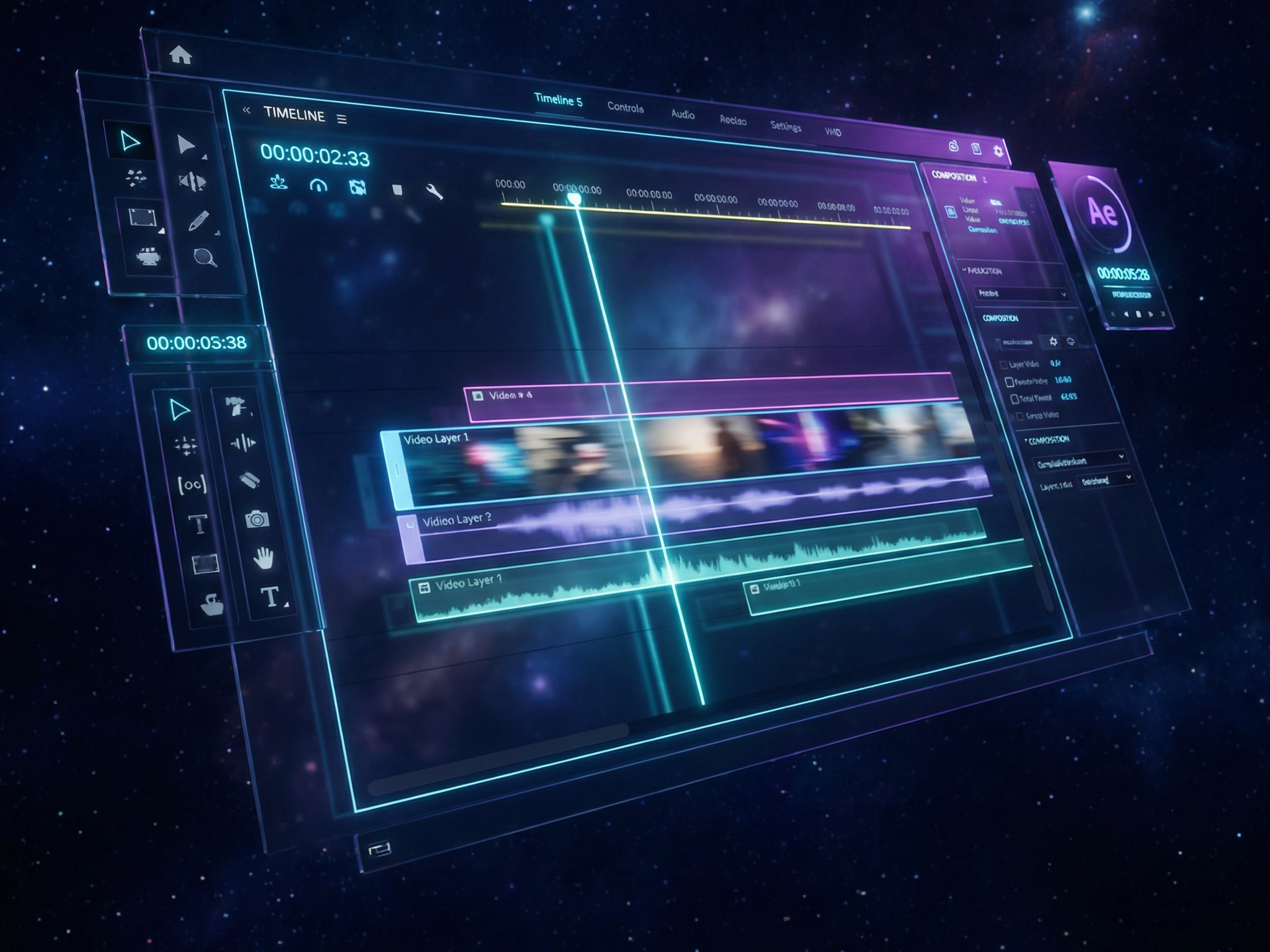
Motion Branding
Bringing the static identity to life using Adobe After Effects. This 5-second mnemonic uses kinetic typography and dynamic easing to create a memorable audio-visual signature for video content.
Digital Touchpoints
A cohesive set of headers designed for cross-platform consistency (YouTube, Facebook, LinkedIn). These assets ensure that the cinematic "look and feel" is instantly recognizable across all digital channels.